Layout Examples
Layout examples to learn how to use MM.css in your projects.
In order to illustrate how to use MM.css for creating the webpage layout, we have included a few examples below:
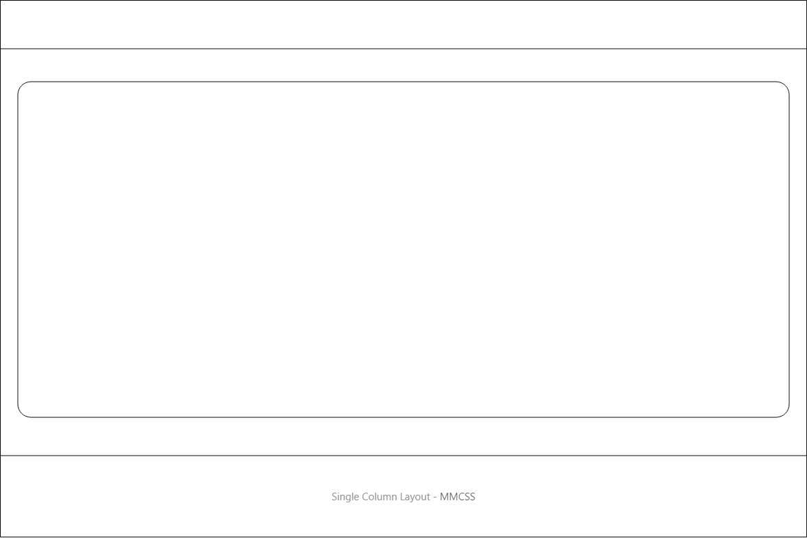
Single Column Layout
This single column layout consists of a header, main content and a footer created with header, container-content and footer classes respectively.
In this example, instead of container-content, you can also use container-wide for a wider containaer, or container-readable for a narrow container suitable for readable text.
If you use the container class instead, you will get a full width container.
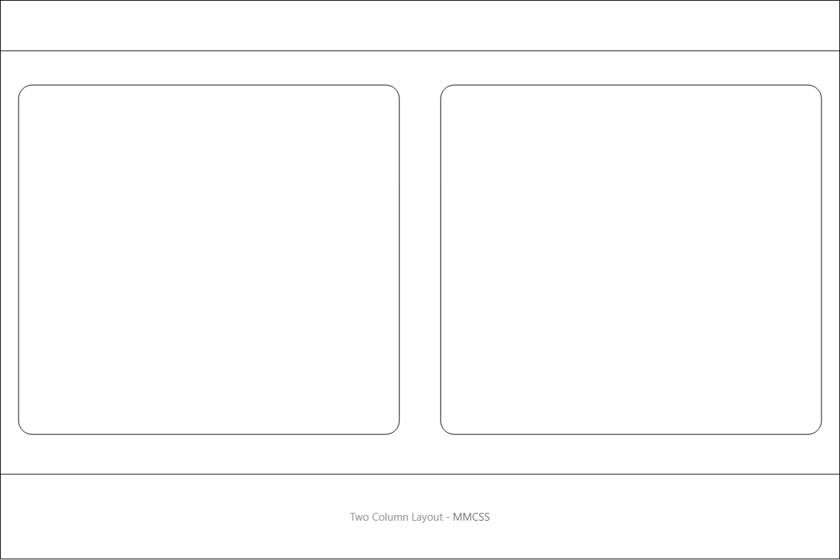
Two Columns Layout
The two column layout consists of a grid with two columns of equal width along with the header and footer. On smaller screens, the columns will expand to occupy full width and will be placed one below the other.
You can add additional cells inside grid and they will automatically span to the next row.
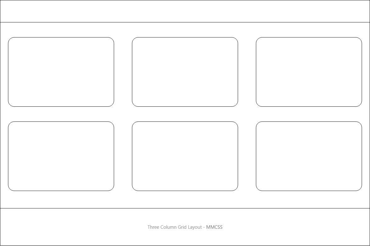
Three Columns Grid Layout
This layout is suitable for displaying content in three columns and multiple rows. On smaller screens, the columns will expand to occupy full width and will be placed one below the other.
While only two rows are shown in example, you can add easily additional cells inside the grid and they will automatically span to the next row.
Instead of using one-third for cells, you can use one-fourth for a four column layout.
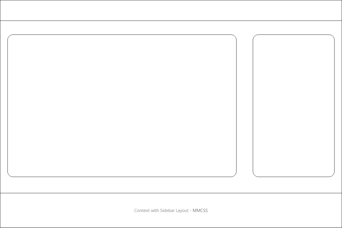
Content with Sidbar Layout
This is a classic website layout with content on left and sidebar or right. On smaller screens, the sidebar will expand to occupy full width and will be placed below the main content.
Similar to this layout, you can easily create a layout with sidebar on left and content on right.
Note that, sidebars created this way have variable width, which depends on width of the browser window. Instead of this, you can create a fixed-width sidebar with fluid content, which is our preferred way of creating layouts having sidebar.
You may also find other advanced MM.css templates for use in your projects.
Want to contribute to the documentation? Edit this page on Github.


